web-designSKILL.md · 77 KB
Web interfaces that don’t look like every other AI‑built page.
The largest of the four by a distance, and almost none of it is a style guide. What it mostly holds is a procedure for arriving at a direction — name the subject concretely, not “a fintech site” but the software that reconciles freight invoices eight hours a day, then find what that subject already looks like in the world and read the palette, the type and the density off that.
Then it checks its own work twice: an audit against the defaults it was most likely to reach for, and a pass/fail list over the half of the job a screenshot never shows — keyboard access, visible focus, contrast, and a form that keeps what you typed.
cp -r web-design ~/.claude/skills/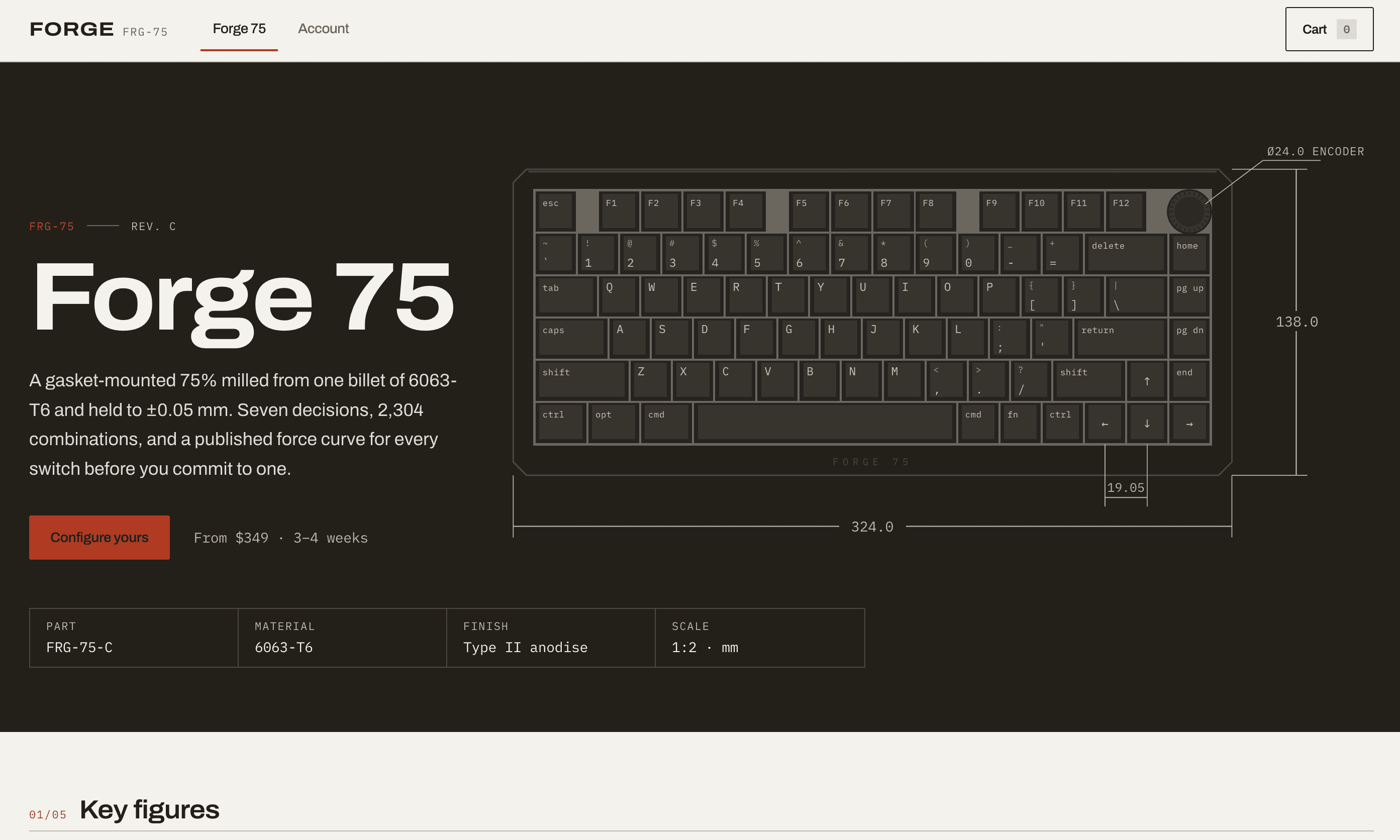
Hero 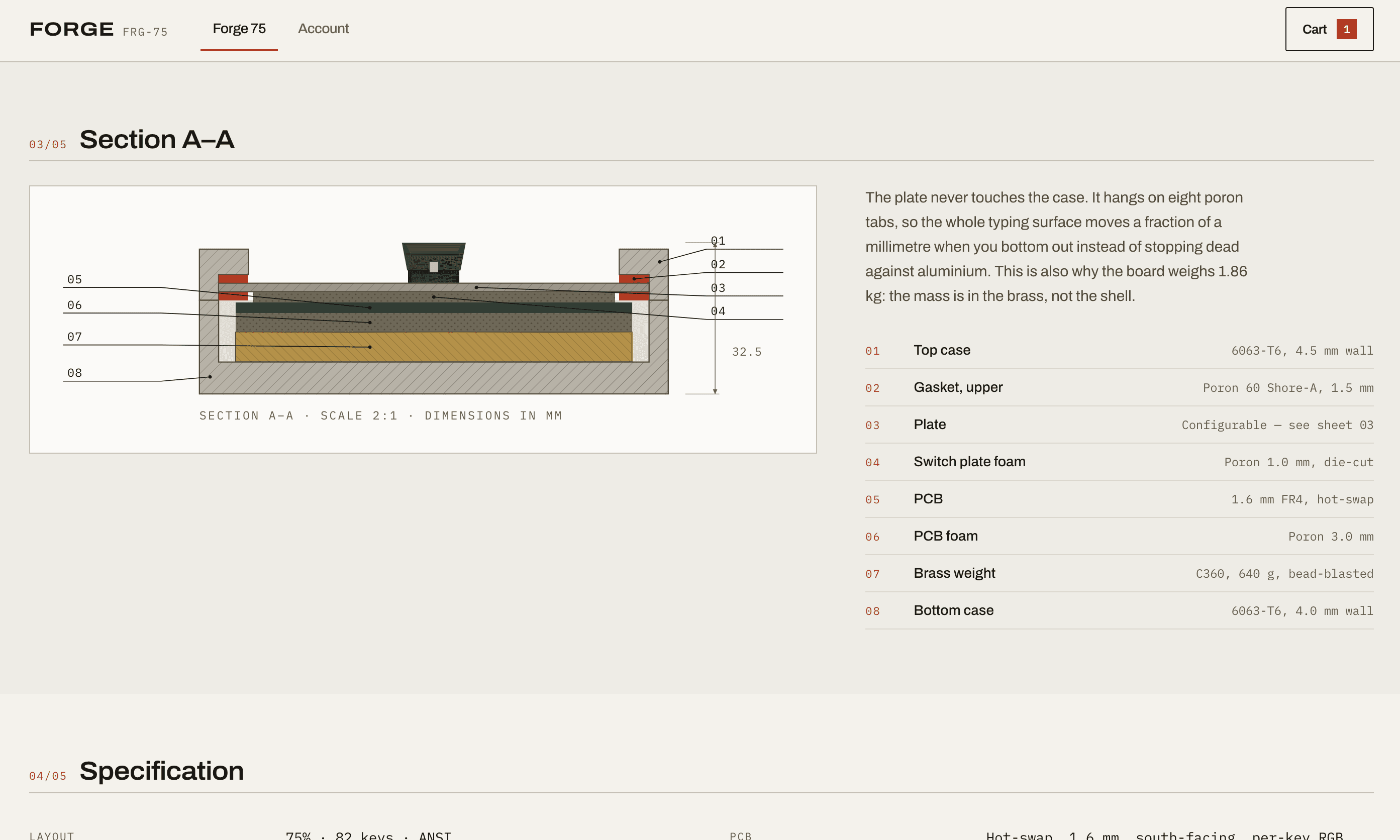
Product details 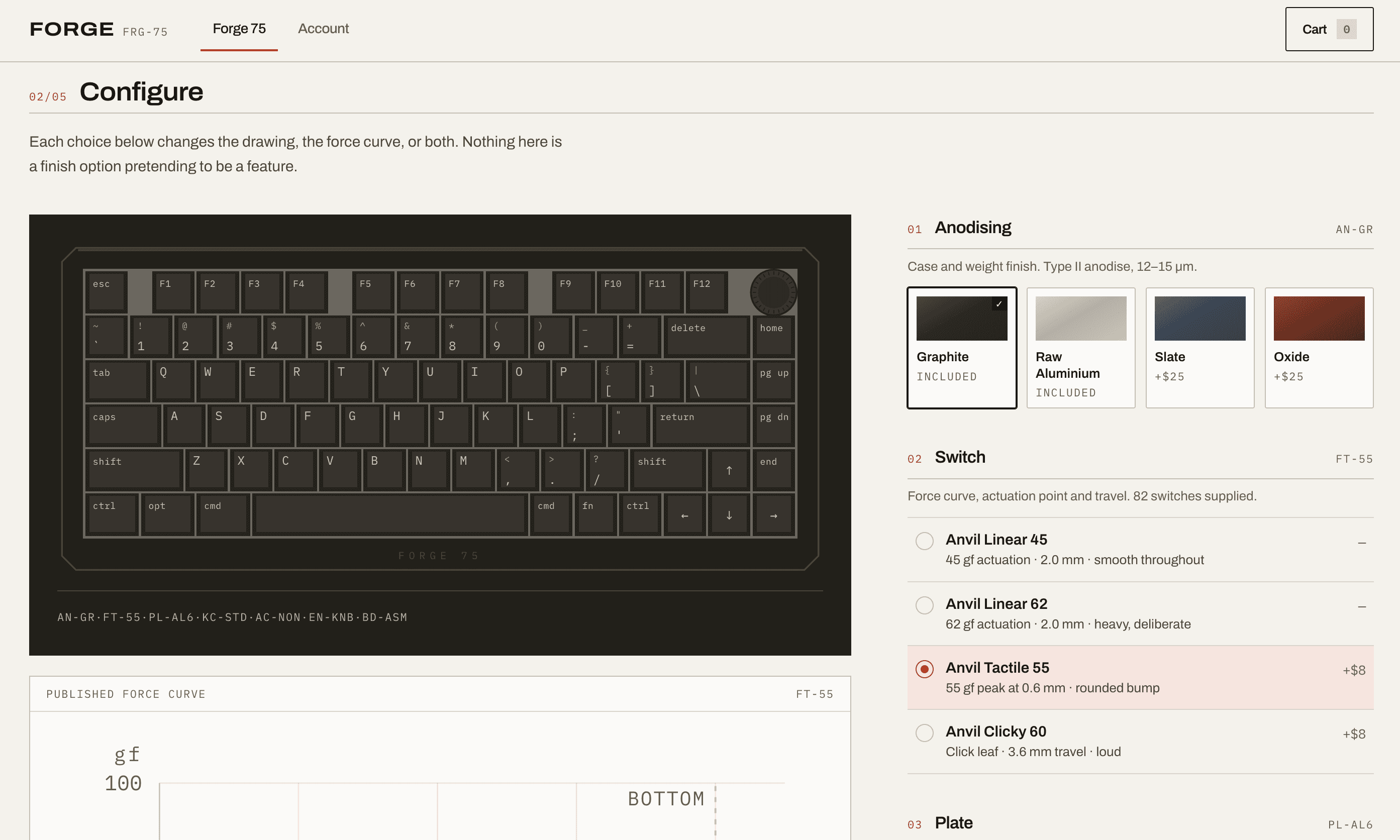
Configure
Account 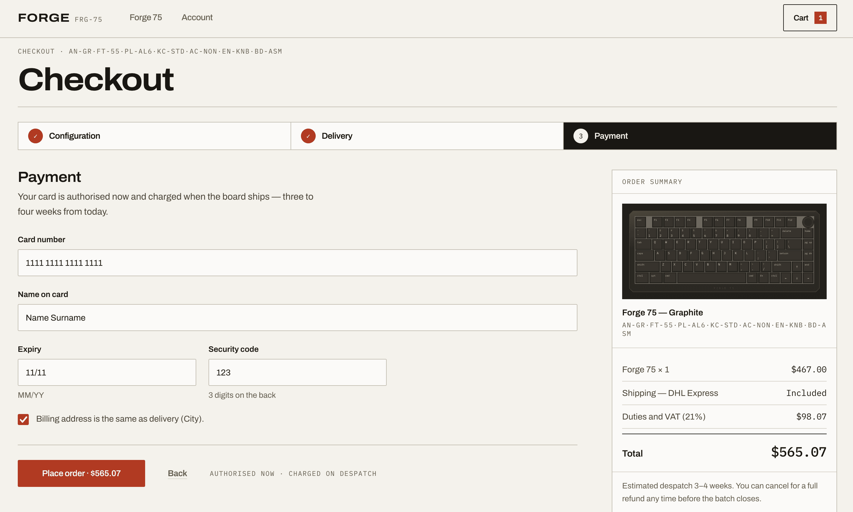
Checkout 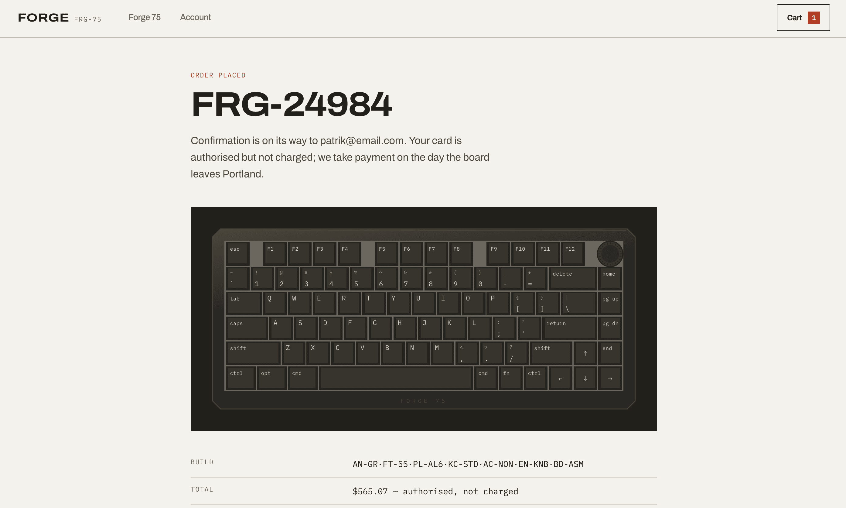
Order placed
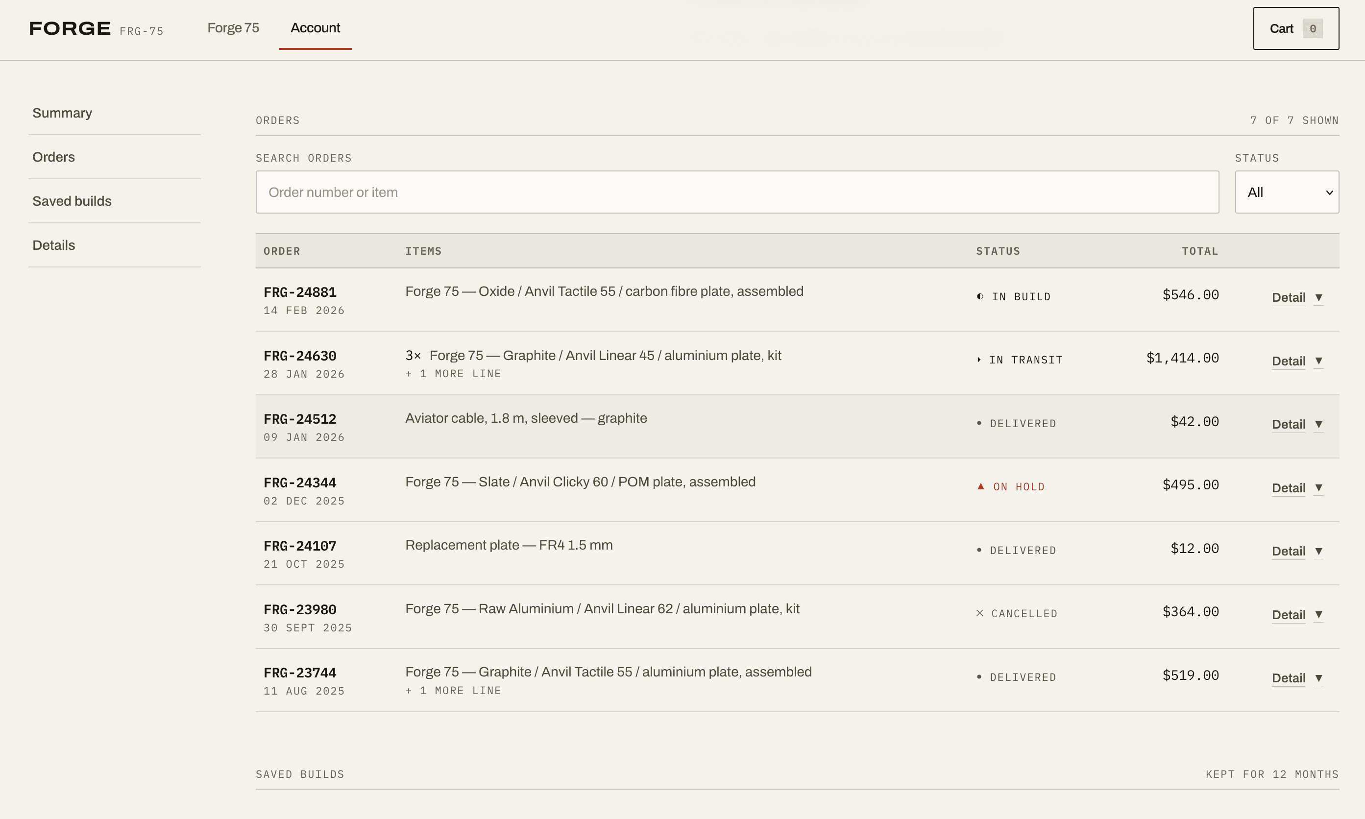
Six screens from one shop — a direct-sale storefront for a machined 75% keyboard, hero to receipt. The direction is read off the object rather than off a mood: dimensioned drawings, a section through the case, numbered parts, quantities in mono. The three in the hero are the easy half; these are the same drawing at the point where nobody is being sold anything.
Plenty of subjects have nothing in the world to derive from, and the file is blunt that forcing one produces decoration with a backstory. So it works down instead — to the verb, because rate limiting is a valve and reconciliation is matching two columns; to the condition the user is in when they arrive; to the constraint that actually shapes the thing. A tax product’s real constraint is dread, and that is a design brief.
It also says outright that your request outranks every aesthetic rule in the file, including the ones written as never. And that the pass/fail checks are correctness rather than preference — so nothing outranks those, and “make it cleaner” is not a request to remove one.